Important: These forums are for discussions between SkyDemon users. They are not routinely monitored by SkyDemon staff so any urgent issues should be sent directly to our Customer Support.

Differences from CAA charts (extra visual items)


Author
Message
Tim Dawson
Tim Dawson
SkyDemon Team (616K reputation)SkyDemon Team (616K reputation)SkyDemon Team (616K reputation)SkyDemon Team (616K reputation)SkyDemon Team (616K reputation)SkyDemon Team (616K reputation)SkyDemon Team (616K reputation)SkyDemon Team (616K reputation)SkyDemon Team (616K reputation)
Group: Forum Members
Posts: 7.8K, Visits: 8.4K
It sounds like you would be better off using a product that can display your position on (for example) an Ordnance Survey map. SkyDemon is not seeking to be such a product, nor are we seeking to be all things to all people (because that would be impossible).
flyingboy
flyingboy
Too Much Forum (563 reputation)Too Much Forum (563 reputation)Too Much Forum (563 reputation)Too Much Forum (563 reputation)Too Much Forum (563 reputation)Too Much Forum (563 reputation)Too Much Forum (563 reputation)Too Much Forum (563 reputation)Too Much Forum (563 reputation)
Group: Forum Members
Posts: 4, Visits: 47
Hi Tim,

No Tim, I wouldn't be better with a OS chart/map. Not every flight is as carefree and unplanned as what I previously described.

My original point, and reason for the post, was simply because you yourself said, that if enough people wanted higher LOD's (road) then that might be considered.

As I and many other microlight pilots use the CAA charts 1:250000 because of the amount of detail on them, we simply were making a request.

I now understand you really don't have that intention of adding to your product in that way.

Fair enough.

Michael
Tim Dawson
Tim Dawson
SkyDemon Team (616K reputation)SkyDemon Team (616K reputation)SkyDemon Team (616K reputation)SkyDemon Team (616K reputation)SkyDemon Team (616K reputation)SkyDemon Team (616K reputation)SkyDemon Team (616K reputation)SkyDemon Team (616K reputation)SkyDemon Team (616K reputation)
Group: Forum Members
Posts: 7.8K, Visits: 8.4K
Let me clarify. If enough people want more detailed roads, railways, rivers etc, we will increase that detail.

What we will not add is landmarks/country houses/castles. Those things, in our opinion, belong on an ordnance survey map and there are many simple apps out there whose job it is to allow such maps to be displayed onscreen with your position overlaid.
Richard747
Richard747
Too Much Forum (2.3K reputation)Too Much Forum (2.3K reputation)Too Much Forum (2.3K reputation)Too Much Forum (2.3K reputation)Too Much Forum (2.3K reputation)Too Much Forum (2.3K reputation)Too Much Forum (2.3K reputation)Too Much Forum (2.3K reputation)Too Much Forum (2.3K reputation)
Group: Forum Members
Posts: 37, Visits: 115
When selecting UK CAA/NATS Chart Style I would prefer an exact replication of the 1:500000 chart to be displayed. Thanks.
Tim Dawson
Tim Dawson
SkyDemon Team (616K reputation)SkyDemon Team (616K reputation)SkyDemon Team (616K reputation)SkyDemon Team (616K reputation)SkyDemon Team (616K reputation)SkyDemon Team (616K reputation)SkyDemon Team (616K reputation)SkyDemon Team (616K reputation)SkyDemon Team (616K reputation)
Group: Forum Members
Posts: 7.8K, Visits: 8.4K
If you want an exact replica of the NATS 1:500k chart, I would suggest you use an app that is designed to display the NATS 1:500k chart.
Richard747
Richard747
Too Much Forum (2.3K reputation)Too Much Forum (2.3K reputation)Too Much Forum (2.3K reputation)Too Much Forum (2.3K reputation)Too Much Forum (2.3K reputation)Too Much Forum (2.3K reputation)Too Much Forum (2.3K reputation)Too Much Forum (2.3K reputation)Too Much Forum (2.3K reputation)
Group: Forum Members
Posts: 37, Visits: 115
Okay, but as customer feedback my preference is for a complete NATS chart option...in SkyDemon.
Joseph
Joseph
Too Much Forum (2.2K reputation)Too Much Forum (2.2K reputation)Too Much Forum (2.2K reputation)Too Much Forum (2.2K reputation)Too Much Forum (2.2K reputation)Too Much Forum (2.2K reputation)Too Much Forum (2.2K reputation)Too Much Forum (2.2K reputation)Too Much Forum (2.2K reputation)
Group: Forum Members
Posts: 18, Visits: 553
People who think VFR flight is not a 'follow the needle' activity, would like to have a detailed digital map or paper printout or JPG made by few clicks after route set up. That could be done in PC version only and keep tablet/mobile versions as we like them - responsive, reliable. The maps in PC version could be an option to be paid for.
rg
rg
Too Much Forum (10K reputation)Too Much Forum (10K reputation)Too Much Forum (10K reputation)Too Much Forum (10K reputation)Too Much Forum (10K reputation)Too Much Forum (10K reputation)Too Much Forum (10K reputation)Too Much Forum (10K reputation)Too Much Forum (10K reputation)
Group: Forum Members
Posts: 109, Visits: 1.9K

Just picking this one up again as I'd just seen a post about it on facebook and read these comments “Our charts are much more accurate than the CAA chart” and “a zoomed-in CAA chart would not be helpful as it doesn't have that kind of resolution.”

I’m not sure the Skydemon chart zooms that well as thevector lines have pretty poor resolution and, to keep performance up, fewer ground features are depicted. The reasons are understandable and I like the Skydemon chart but I think there is a tendency to be a little dismissive of the use of the CAA charts. Runway HD seems to do alright offering the CAA 1:500kchart as a separate map subscription. If only it was available on Android!

The Skydemon chart may be “more accurate” but not necessarily as clear in every aspect. While it’s true that its generally less cluttered and has better contrast (well perhaps the SD styles) there are areas where things could be improved for the Skydemon chart in CAA style....

Airspace step-downs are not as clear.  The CAA chart visually highlights which sideof the intermediate line is within controlled airspace.

Airspace is not shown as clearly in some parts of the country.  It may be accurate but the chart appears cluttered. Particularly for class A between Birmingham and Brize.  OK you can hide features above but if you’re trying to get Skydemon CAA style chart to depict something like the CAA chart you end up with a mess or red lines. Only the external extents of the class A is relevant on a VFR chart.  The line separating M605 from Daventry CTA is not necessary.

http://forums.skydemon.aero/uploads/images/ae42c87b-1f46-4b9b-94e2-7fd4.png


http://forums.skydemon.aero/uploads/images/986f8c32-4590-4b4b-a93c-719e.png


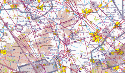
Reducing the airspace removal level to say 6500 yields some surprising differences between CAA and Skydemon as to what is in or out of class A. One may be more accurate than the other but they're different and surely there shouldn't be.

Airfield name text size / placement could be improved at 1:500k. Its interesting zooming in and seeing which labels seem to stop other labels showing.  At 750k Fairford (military and not open to us civil VFR types) seems to block Kemble but at 500k Down Ampney (disused) blocks Fairford.  Whats the logic for which has priority?

Not all danger / restricted areas are named and the larger areas like D123 are not named as clearly in that the name follows an edge instead of being clearly within the area. This is made worse when smaller text is obliterated by the boundary hatching. This is less apparent in the Skydemon style because of color contrast.  Perhaps a bold font in the CAA style would help.

Masts / Lit Masts symbols not as clear.

VRP naming not as clear

Motorways not named and service stations junctions are not clearly shown.  This could be an optional layer under terrain features.

Fewer villages and hamlets shown. Have an option turn show /hide villages  and hamlets less that 1km2if necessary but currently which yellow circles are shown seems to be a bit random.

Fewer roads and water courses shown.   Again,could be an option to show minor roads or when zoomed in to equivalent of say the 1/4mil chart (personally not that fussed about this).

Some towns and large villages not named. Which ones are not named does not appear to be connected to size or level of zoom.

The visual contrast of wooded areas is not as clear.  The shade of green needs adjusting or perhaps edge in a slightly darker shade.
http://forums.skydemon.aero/uploads/images/604859dd-6d08-4077-ad53-a8db.png

How about a user customizable chart style??


Edited 3/28/2015 10:08:25 AM by rg
rg
rg
Too Much Forum (10K reputation)Too Much Forum (10K reputation)Too Much Forum (10K reputation)Too Much Forum (10K reputation)Too Much Forum (10K reputation)Too Much Forum (10K reputation)Too Much Forum (10K reputation)Too Much Forum (10K reputation)Too Much Forum (10K reputation)
Group: Forum Members
Posts: 109, Visits: 1.9K
rg (3/28/2015)

Airfield name text size / placement could be improved at 1:500k. Its interesting zooming in and seeing which labels seem to stop other labels showing.  At 750k Fairford (military and not open to us civil VFR types) seems to block Kemble but at 500k Down Ampney (disused) blocks Fairford.  Whats the logic for which has priority?


I've just noticed on this point that the behavior is different on phone, tablet and PC.  I would have expected (from users perspective) that the information on the chart at the same relative level of zoom would be the same.  font size and screen size are obvious difference but then the Oldbury on Severn and Bowldown text appears to be the same relative size on the chart on tablet and PC and the Bowldown on phone appears int he same place and size so it look like the same information COULD fit and be displayed in the same positions.


Edited 3/30/2015 7:22:22 AM by rg
Tim Dawson
Tim Dawson
SkyDemon Team (616K reputation)SkyDemon Team (616K reputation)SkyDemon Team (616K reputation)SkyDemon Team (616K reputation)SkyDemon Team (616K reputation)SkyDemon Team (616K reputation)SkyDemon Team (616K reputation)SkyDemon Team (616K reputation)SkyDemon Team (616K reputation)
Group: Forum Members
Posts: 7.8K, Visits: 8.4K
Sorry, this is never going to happen.

No chart is perfect and different chart styles suit different people. Pointing out there are differences between two charts is interesting but not really productive, as we do not seek to emulate any particular printed chart. The fact that SkyDemon charts tend to lack lots of "scenery" detail compared to many printed charts is very much deliberate. It's the aeronautical features we emphasize in SkyDemon and on many occasions our charts have been proved to show correct information whereas printed charts (which are out of date by the time you can even purchase them) are sadly lacking in this respect. It is the nature of vector charts that labels are not cartographically and individually placed.
GO

Merge Selected

Merge into selected topic...


Merge into merge target...


Merge into a specific topic ID...


Reading This Topic

Login

Explore
Messages
Mentions
Search