|
Tim Dawson
|
|
|
Group: Forum Members
Posts: 8.3K,
Visits: 9.9K
|
Well, we now have secondary roads at 250k scale so there are hundreds (at least) of those across Sweden in the new chart. We should have more town waypoints, too. If you think an area is particularly sparse and you know there is a town there which you think we should have, let us know. We can take a look and see if there's anything we can do.
As I mentioned, the river data is not very good from the Swedish source. I can definitely get them all to appear at 250k scale for you, but there won't be a gradual increase in the number of rivers shown as there is elsewhere in Europe (for the time being, anyway).
It's possible there might be some tiny urban areas which are currently excluded by a size threshold. If you can come up with an example or two - towns with a distinctive shape, which you think are large enough to be identified from the air but which we do not have, I will look specifically at them to see if we can do anything.
|
|
|
|
|
lhe
|
|
|
Group: Forum Members
Posts: 154,
Visits: 445
|
Tim Dawson (7/27/2015)
Could you tell us exactly what new detail you were hoping for?I was hoping for something like the examples from the Rotterdam area earlier in this thread. More roads and more urban areas. Generally speaking more visual features that could be identified from the air.
|
|
|
|
|
Tim Dawson
|
|
|
Group: Forum Members
Posts: 8.3K,
Visits: 9.9K
|
Could you tell us exactly what new detail you were hoping for?
|
|
|
|
|
lhe
|
|
|
Group: Forum Members
Posts: 154,
Visits: 445
|
Tim Dawson (7/23/2015)
*Thread titles like "Improved charts. Really?" are not constructive; they just make us feel bad and wish we hadn't bothered.I apologise if you feel offended by the title. I wrote it out of frustration as I had high hopes about this chart revision. I believe I have been constructive by posting examples of the old and new charts and pointing out what I feel is the problem. (And also in confirming that the accuracy has indeed been greatly improved.) I am happy for the users in the Netherlands and Germany where the detail has also apparently been much improved.
|
|
|
|
|
Tim Dawson
|
|
|
Group: Forum Members
Posts: 8.3K,
Visits: 9.9K
|
It is difficult to please everybody, when it comes to a complete overhaul of the scenery detail across virtually our entire European coverage. Rest assured that we didn't do this - which cost us many thousands of Euros - to make things worse for anybody.
As the dust settles we will respond to constructive* feedback on specific regions, and concentrate more effort on that specific mapping to address any issues which may be occurring due to local differences in source data quality. Sadly, for example, in our new dataset it happens that Sweden doesn't give us very good data on the hierarchy of watercourses.
*Thread titles like "Improved charts. Really?" are not constructive; they just make us feel bad and wish we hadn't bothered.
|
|
|
|
|
lhe
|
|
|
Group: Forum Members
Posts: 154,
Visits: 445
|
Mike@EDTG (7/23/2015)
One question though, I personally like the SkyDemon 1 chart style most - especially the outlined towns (yellow). In Scales below 250k this chart style changes the color of these outlines into a harder to recognize sandy color (2nd picture). What do you think about staying with the yellow colour in scales below 250k, like in the French SIA style (3rd picture)I second that!
|
|
|
|
|
lhe
|
|
|
Group: Forum Members
Posts: 154,
Visits: 445
|
oscarbal (7/23/2015)
Well, I have 2 nice examples of a good improvement.Good for you! That was the kind of improvement I had hoped for. Don't forget zooming in will reveal more details. Not in my case. Not even 1:5000 helps.
|
|
|
|
|
Mike@EDTG
|
|
|
Group: Forum Members
Posts: 164,
Visits: 757
|
A lot improvement below 250k, really nice - thank´s for this Tim. One question though, I personally like the SkyDemon 1 chart style most - especially the outlined towns (yellow). In Scales below 250k this chart style changes the color of these outlines into a harder to recognize sandy color (2nd picture). What do you think about staying with the yellow colour in scales below 250k, like in the French SIA style (3rd picture) thx -mike 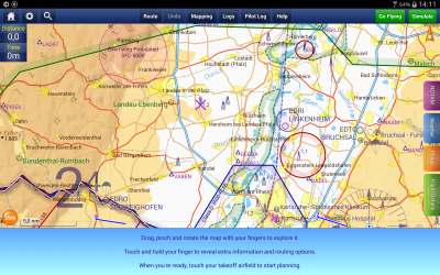 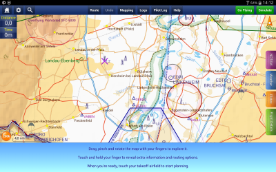 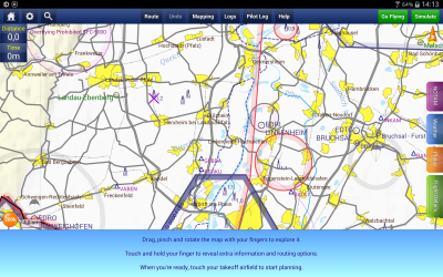
|
|
|
|
|
oscarbal
|
|
|
Group: Forum Members
Posts: 8,
Visits: 41
|
Well, I have 2 nice examples of a good improvement. Although some disconnected roads were introduced as well. See other topic. http://forums.skydemon.aero/Topic16432.aspxDon't forget zooming in will reveal more details. Some examples from The Netherlands where you can really see the map improvements (at scale 1:250k) 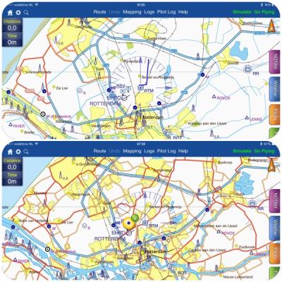 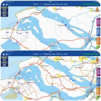
|
|
|
|
|
lhe
|
|
|
Group: Forum Members
Posts: 154,
Visits: 445
|
So now I have downloaded the improved charts. I must confess I was disappointed - I had expected more details in the charts. Particularly in light of the Facebook posting: In next week's chart update we are introducing more detailed scenery data across Europe. This includes roads, railways, rivers, lakes and the coastline. Unlike our previous data, the new data will be spatially perfect, and even scenery in large-scale georeferenced plates will match up.
Along with geographical data, the town waypoints will also change. You should see more smaller towns as you zoom in, and a better selection of towns at each zoom scale.
The new charts will also include secondary roads, when you are zoomed to 1:250k or larger scales, which should help people operating at a low height.
The accuracy does seem better now and that is of course a very, very, good thing, but as regards detail I can't see any improvement - rather the opposite. At least for Sweden. Yes, a few roads have been added, but some waterways and even towns/villages have been removed (even at the largest scales). Look at the following two screenshots of the area west of Uppsala (ESKC/ESCM) at 1:250000. The first one using the old charts and the second one using the new charts. (Taken on different devices, as I can obviously not revert to the old version once I've updated.) 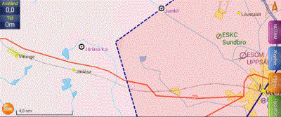 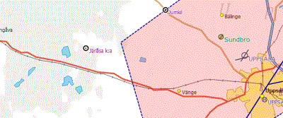 You can see the improved accuracy in how the roads are rendered. But you can also see that all waterways are gone and so are the villages of Vittinge, Järlåsa and Lövstalöt. Well, actually, in the new charts you can see a fragment of the river in the upper right corner. (Yes, I have enabled rivers in the mapping settings! There are rivers shown in other places.)
|
|
|
|