|
Tim Dawson
|
|
|
Group: Forum Members
Posts: 8.3K,
Visits: 9.9K
|
Thanks Markus for the feedback. To be clear, the selected sector should have a big blue outline. Do you not see that on your PC?
|
|
|
|
|
srayne
|
|
|
Group: Forum Members
Posts: 388,
Visits: 8.3K
|
Tim Dawson (7/30/2014)
Thanks Markus for the feedback. To be clear, the selected sector should have a big blue outline. Do you not see that on your PC?I think Markus may have been referring to the iPad display. On the PC I see a faint blue surround to the selected sector (which could be more pronounced, or maybe better to dim magenta line for the non-selected sectors). On an Android tablet the blue surround is very thin and very faint and is easily missed if you don't know what to look for. I realise that you have not updated the Android and iPad versions to support this feature yet and am pleasantly surprised that it worked at all with split sectors - great stuff.
|
|
|
|
|
mjk
|
|
|
Group: Forum Members
Posts: 12,
Visits: 213
|
Tim Dawson (7/30/2014)
Thanks Markus for the feedback. To be clear, the selected sector should have a big blue outline. Do you not see that on your PC?Hi Tim, my windows version shows 3.0.8.0 and does NOT have a blue line .. even so I can't believe this has anything to do with Crossover on Mac OSX, so I will check the same under a true Windows VM. Not sure if my lengthy text was clear ... colored segments are one element, the data entering on these and the combined view under one "Flight Detail" tab are the others. Happy to describe in more detail if needed, also offline. Thanks Markus 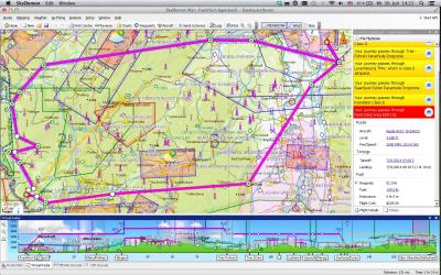
|
|
|
|
|
mjk
|
|
|
Group: Forum Members
Posts: 12,
Visits: 213
|
srayne (7/30/2014)
Tim Dawson (7/30/2014)
Thanks Markus for the feedback. To be clear, the selected sector should have a big blue outline. Do you not see that on your PC?I think Markus may have been referring to the iPad display. On the PC I see a faint blue surround to the selected sector (which could be more pronounced, or maybe better to dim magenta line for the non-selected sectors). On an Android tablet the blue surround is very thin and very faint and is easily missed if you don't know what to look for. I realise that you have not updated the Android and iPad versions to support this feature yet and am pleasantly surprised that it worked at all with split sectors - great stuff. intact its the same on both devices .. as you can see from the virtual radar .. the first leg EDFE-EDRJ is active, but both legs incl the return are same colored. its already great stuff, can not agree more, but some elements could be tuned a bit more 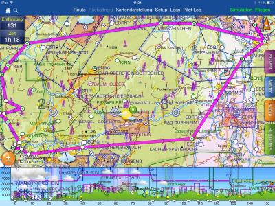
|
|
|
|
|
mjk
|
|
|
Group: Forum Members
Posts: 12,
Visits: 213
|
Tim Dawson (7/30/2014)
Thanks Markus for the feedback. To be clear, the selected sector should have a big blue outline. Do you not see that on your PC?Hi Tim, just related my post regarding the Flight Details Tab while defining a multi Leg flight.Right now I see that by clicking one of the legs the flight details tab fills with the respective data for that particular leg.More preferable from my point of view would be to expand the tab by each leg and with that let the pilot scroll if necessary to the details within the same tab. this would allow simple data validation like tack off time for the following leg, fuel consumption etc .. Hope this helps to spin some thoughts for your great product to make it even better Cheers
Markus 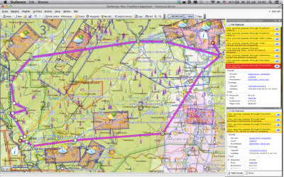
|
|
|
|
|
Tim Dawson
|
|
|
Group: Forum Members
Posts: 8.3K,
Visits: 9.9K
|
The resolution of your screenshots is not sufficient for us to understand what you're talking about, I'm afraid. You mentioned virtual radar, but that doesn't make sense because this feature has nothing to do with virtual radar. Only on the main map is the selected sector highlighted with a blue outline (and only when there are multiple sectors).
I see what you mean about the flight details tab, we will take it into consideration when designing potential future enhancements.
|
|
|
|
|
mjk
|
|
|
Group: Forum Members
Posts: 12,
Visits: 213
|
Tim Dawson (7/30/2014)
The resolution of your screenshots is not sufficient for us to understand what you're talking about, I'm afraid. You mentioned virtual radar, but that doesn't make sense because this feature has nothing to do with virtual radar. Only on the main map is the selected sector highlighted with a blue outline (and only when there are multiple sectors).
I see what you mean about the flight details tab, we will take it into consideration when designing potential future enhancements.when I mentioned "virtual radar" in reference to the picture, is simply the nice fact, that the radar screen shows you the active leg ... in the case of that picture the first leg (hence it made sense from my point of view to mention this, as there is no other indication in my case / there is NO blue line, as you where mentioning, neither on the windows version, nor on the ipad, as you can see from the pics
|
|
|
|
|
srayne
|
|
|
Group: Forum Members
Posts: 388,
Visits: 8.3K
|
This is what I see on my PC. Note the (very) faint blue surround to the Northern sector. 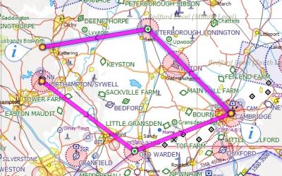
|
|
|
|
|
mjk
|
|
|
Group: Forum Members
Posts: 12,
Visits: 213
|
OK now I see whats meant with "blue line" and as I focused in, I see this on my side as well.. Must admit, I do not find this type of highlighting the active leg useful, not differentiated enough .. rather I would see a real blue line with a magenta fade aside or anything like this (ideally configurable). Brings me back to virtual radar, as this is then the only dominant visual indication witch leg is currently active, aside of the flight details tab, witch should have the right title. 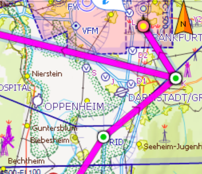
|
|
|
|
|
srayne
|
|
|
Group: Forum Members
Posts: 388,
Visits: 8.3K
|
mjk (7/31/2014)
not differentiated enoughI agree. @Tim: How about fading the magenta line for the inactive sectors?
|
|
|
|