|
Wire
|
|
|
Group: Forum Members
Posts: 19,
Visits: 46
|
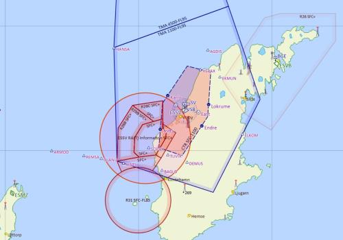
 In this screenshot one of the marked areas is not a real Restricded area. Can you see which one? It is put in ther by Skydemon to highlight a change in real restrictions. In reality, it is more of a nuisance than a help. Please stop doing this. If you for some reason absolutely must do it, make it the same size and shape as the area you want to mark out!!
|
|
|
|
|
grahamb
|
|
|
Group: Forum Members
Posts: 636,
Visits: 31K
|
+x In this screenshot one of the marked areas is not a real Restricded area. Can you see which one? It is put in ther by Skydemon to highlight a change in real restrictions. In reality, it is more of a nuisance than a help. Please stop doing this. If you for some reason absolutely must do it, make it the same size and shape as the area you want to mark out!! It's not fake restricted area. The circle represents the 'radius of influence' as specified in the NOTAM itself, and is intended to highlight to anyone planning to operate in that area that there is something happening that may be of interest to them. Reading the NOTAM text makes it clear what the intention is.
The way SD depicts it, i.e. using the radius of influence, is the standard way that every system that I've used has done it since graphical plotting became a thing some years ago.
|
|
|
|
|
Wire
|
|
|
Group: Forum Members
Posts: 19,
Visits: 46
|
+x+x In this screenshot one of the marked areas is not a real Restricded area. Can you see which one? It is put in ther by Skydemon to highlight a change in real restrictions. In reality, it is more of a nuisance than a help. Please stop doing this. If you for some reason absolutely must do it, make it the same size and shape as the area you want to mark out!! It's not fake restricted area. The circle represents the 'radius of influence' as specified in the NOTAM itself, and is intended to highlight to anyone planning to operate in that area that there is something happening that may be of interest to them. Reading the NOTAM text makes it clear what the intention is.
The way SD depicts it, i.e. using the radius of influence, is the standard way that every system that I've used has done it since graphical plotting became a thing some years ago. Of course I understand what it is. I just dont like it. This 'radius of influence' is graphically much too similar to a restricted area I feel. Sometimes Skydemon depicts recent changes by making the area outline fatter which is IMHO a much better way.
AirMate has this feature as a thin blue line without any hatched infill. The feature is also possible to hide by a configuration option chechkbox. A better way to do it.
|
|
|
|
|
pgroell
|
|
|
Group: Forum Members
Posts: 102,
Visits: 18K
|
You can hide them with the Graphical NOTAM switch in the Layer Menu (bottom right on the chart)
|
|
|
|
|
grahamb
|
|
|
Group: Forum Members
Posts: 636,
Visits: 31K
|
Yes indeed. I had intended to add that to the bottom of my reply but the system doesn’t let you edit a post straight away and I ran out of time waiting ……
|
|
|
|
|
Wire
|
|
|
Group: Forum Members
Posts: 19,
Visits: 46
|
+xYes indeed. I had intended to add that to the bottom of my reply but the system doesn’t let you edit a post straight away and I ran out of time waiting …… Great! It was that simple. Thanks!
|
|
|
|
|
Tim Dawson
|
|
|
Group: Forum Members
Posts: 8.3K,
Visits: 9.9K
|
Your screenshot did not show a restricted area, it showed a NOTAM. Turning off graphical NOTAMs is not generally a great idea because they are extremely useful. However, some authorities don't always publish them very well. If they publish them in a manner that makes it unclear to which restricted area they are referring, which is likely in this case, we cannot "snap" them to the shape of their restricted area. That's when we revert to the circular depiction.
If you still have the original NOTAM text handy, that might help us investigate if we can do any better.
|
|
|
|
|
JurijG
|
|
|
Group: Forum Members
Posts: 1,
Visits: 0
|
Maybe they can be made more visually distinct from actual restricted areas? This is ED-R Eutin and it's NOTAM circle, which look very close to each other...
|
|
|
|
|
Tim Dawson
|
|
|
Group: Forum Members
Posts: 8.3K,
Visits: 9.9K
|
That's a different issue, really. Sometimes a country will publish information about a restriction in both a NOTAM and a SUP to the AIP. We don't know when this happens, and in this case, you get both. Since you've brought it to my attention I've hidden the NOTAM, as in this case, it's unnecessary.
|
|
|
|
|
Wire
|
|
|
Group: Forum Members
Posts: 19,
Visits: 46
|
+xThat's a different issue, really. Sometimes a country will publish information about a restriction in both a NOTAM and a SUP to the AIP. We don't know when this happens, and in this case, you get both. Since you've brought it to my attention I've hidden the NOTAM, as in this case, it's unnecessary. Since restriction areas and NOTAMS look very similar initially I didn't realise they were different and the NOTAMS could be hidden. The forum swiftly corrected me on this misunderstanding, thank you.
One suggestion to make the difference more obvious: Make the NOTAMS a very different color like light blue.
|
|
|
|