By GalaxyzA11+ - 6/15/2026 12:28:41 PM
Tim, you forgot to mention the word "verticale". It appears to be a translation failure at least in French and perhaps in German also. What meaning did you wish to give to this word ? (AGL, AAL, AMSL, something else ?) You should use only aeronautical terms and not words from general vocabulary, this leads to confusion.
From the point of view of the graphic design, the logical way of presenting information, and the quality of the translation, the "What's Here?" experience has been redesigned by a student to present information less effectively. You should accept this fact rather than looking for explanations that don't hold water.
If you think the lowest airspace should be at the top of the airspace list, then you could also turn the chart upside down for the next release 😉 ... (The student will be happy to have something to do) 😀
|
By KimW - 6/15/2026 4:16:09 PM
On small Form factor Tims comment makes sense. A reversed stack would mean scrolling to see the most relevant info. 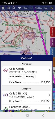
|
By GalaxyzA11+ - 6/15/2026 10:41:48 PM
I don't understand why people who use 8, 9,10,11 inch screens should endure limitations because of people using a smartphone to fly. A smartphone is too small to allow fast manipulations, it consumes time and show less informations than a regular tab screen. The rule should not be dictated by a poorly adapted tool.
Now I will be quiet (I don't want to bore anyone), and patiently await for the aeronautical définition of "Vertical 2500ft - FL115" 🤔 ✨I'm curious to know who approved this before release. 🤗
|
By Tim Dawson - 6/16/2026 8:12:57 AM
Your "before" and "after" screenshots are using different chart styles, that's why the colours are different. We have not changed anything about the colours in the new version.
The airspaces listed in What's Here have been in the order of lowest (most important) to highest (least important) for 15 years, we are certainly not going to change that design any time soon. It's not a graphical representation of space, it's a list of stuff under your finger from most important (or most likely to be interacted with, hence waypoints first) to least important.
The scale of the airspace stack has not changed since we invented it many years ago.
If you are going to give feedback that is not accurate, is a misunderstanding, or on items that have been that way for many years and have nothing to do with the latest version, do not be surprised if your feedback is not acted upon.
|
By GalaxyzA11+ - 6/16/2026 12:42:55 PM
+xYour "before" and "after" screenshots are using different chart styles, that's why the colours are different. We have not changed anything about the colours in the new version.
The airspaces listed in What's Here have been in the order of lowest (most important) to highest (least important) for 15 years, we are certainly not going to change that design any time soon. It's not a graphical representation of space, it's a list of stuff under your finger from most important (or most likely to be interacted with, hence waypoints first) to least important.
The scale of the airspace stack has not changed since we invented it many years ago.
If you are going to give feedback that is not accurate, is a misunderstanding, or on items that have been that way for many years and have nothing to do with the latest version, do not be surprised if your feedback is not acted upon. Hi Tim, the illustration has been picked up in a manual to illustrate the evolution. I'm sorry if it leads in a confusion, I was not willing to say it was from the previous version. At least it was "once upon a time" and it illustrate that it was more easy to read than the current version, and with items classified through altitude.
I was wrong with the scale, there were only two aera on the graph and only the upper has a slide/compression effect. I believed we can now change each segment, which was a mistake of mine. It works fine with more than two segments, sorry for that.
Now, getting back to the subject, we are not arguing for changing the order of the main segments, but the order within certain segments, i.e. Airspace. (See "Before" illustration) In the example bellow, the order of 5-6-7 could certainly be 7-6-5. But yes, in my mind I would classify all sub-item inside "Airspace" family through their height and/or altitude, low > bottom, high > top.
Should a RMZ be in last position ? I my mind yes, because it start's at ground. At least this refutes the argument that on a phone you see nearly everything at the top of the list, whereas here with the RMZ you have to go all the way to the bottom before seeing it in the current version.
You have had the right order previously (not only the color but also the order inside the segment) and it was easy to read. And it is a non sense to write "VERTICALE" in this list. (It is boring and totally useless to read that thousands of times🤯) Would you wrote "AERA NAME" before each sub-item in the next release ? 🫤
Thank you for the discussion Tim, I'm going to stop arguing and wish you a good day 🫡 Bons Vols !
|
By Tim Dawson - 6/17/2026 9:41:04 AM
The airspace stack colours are based on the chart style you have selected. In the screenshot from the manual, a SkyDemon chart style is selected. If you have selected another one, then your airspace stack colours will be different.
I was slightly wrong about the ordering of airspace items in what's here: it's done by type first, then vertical limits. So controlled airspace will appear first, followed by D/R/P areas, then others. Although we have no objection to changing this if people don't like the way it works, it has been like that for a great many years so we consider it stable.
Your own screenshot is quite messy because you've set your automatic decluttering settings so that lots of high airspace is included. I had to adjust my settings to generate a what's here that has so much information. You might consider adjusting those settings.
I agree with you that the "vertical" is unnecessary; this was always included in the PC version and it made its way to the now-standardised what's here in the latest version. It's likely that we will revert that change.
|
By lve0200 - 6/18/2026 10:10:38 AM
Hi, I want to say something positiv: I LOVE IT !! I use the PC version to plan long haul flights from SW France across Europe and a 10" tablet for in flight navigation. For me its (almost) perfect.
|
By GalaxyzA11+ - 6/21/2026 2:42:28 PM
+xThe airspace stack colours are based on the chart style you have selected. In the screenshot from the manual, a SkyDemon chart style is selected. If you have selected another one, then your airspace stack colours will be different.
I was slightly wrong about the ordering of airspace items in what's here: it's done by type first, then vertical limits. So controlled airspace will appear first, followed by D/R/P areas, then others. Although we have no objection to changing this if people don't like the way it works, it has been like that for a great many years so we consider it stable.
Your own screenshot is quite messy because you've set your automatic decluttering settings so that lots of high airspace is included. I had to adjust my settings to generate a what's here that has so much information. You might consider adjusting those settings.
I agree with you that the "vertical" is unnecessary; this was always included in the PC version and it made its way to the now-standardised what's here in the latest version. It's likely that we will revert that change. Hello Tim, Version 4.3.1 flushes the vertical word, thank you all' 🤗 I think decluttering is not the point. As you said now, it is not classified from Most to Last important, but by familly and sub-familly. The first request was not to change that order, but only to sort the data inside a sub-familly. Familly : Airspace Sub-familly : A,B,C,D,E sorted by floor, higher floor on top, lower floor below of the list. Sub-familly : R,D,P, Mil sorted by floor from height to low also. I think it was the first intention at top of the subject.
If I would be alone, I would sort this subs-item all together, including RMZ and TMZ, as a single familly (Airspace) I only mean the items inside the airspace familly. Not the other familly. In fact, the airspace would be sorted by height, like the graph does. In think it confusing to read.
And last but not least, you previously wrote that if someone would like to identify one sub through its height, he should use the graph... But the graph is not longer showing that different aeras ! 😒 Oups....they disapear...! I.e. when multiple controlled airspace are superimposed , only a single overall zone is despicted in blue on the graphic... ( Containing E, D and CTR without vertical separator) This is not hepling a lot o identify who's who. Have a nice week ! 🤗
|
By hummelfn - 6/15/2026 5:34:03 AM
Hei Team
As always: great work.
One suggestion for the „What is here“ Tab:
The callout „vertical“ is unnecessary and self evident. It would rather help to have the different airspaces vertically stacked in the right order, meaning the lowest airspace at the bottom and the highest airspace on top. That would be easier to read…
Thanks a lot 😊
|
|